matthewfield.ca
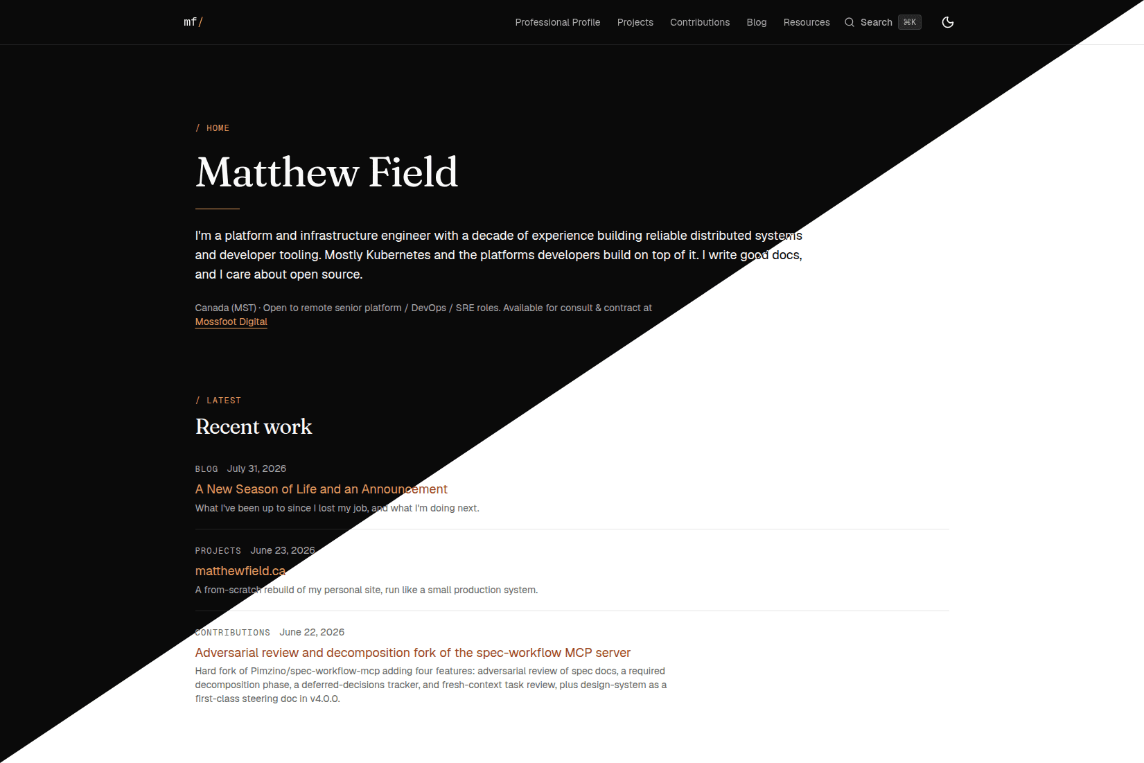
This is the site you're reading. I rebuilt it from scratch to be somewhere I actually control, where my work, writing, and notes live next to the code that renders them, with no CMS in the middle.
Why a rebuild
The old version was a static résumé I never touched. I wanted something closer to how I work: content in version control, every change reviewed and shipped the same way I'd ship anything else, and enough structure to leave room to write. Running my own site like a small production system was the point, not a side effect.
How it's built
Next.js with the App Router and TypeScript, styled with Tailwind CSS v4 and shadcn/ui. Content is MDX. Velite validates it at build time against a typed schema, so a malformed frontmatter field fails the build instead of shipping broken. It deploys on Vercel, and GitHub Actions runs type checks, linting, content validation, accessibility scans, and Lighthouse budgets before anything merges. The colophon has the full stack.
What I cared about
Boring, fast pages, with no client JavaScript on content routes that doesn't earn its place. Light and dark treated as a matched pair rather than an afterthought. Accessibility checked in CI with axe and Playwright instead of assumed. And a design system kept as its own steering document, so visual decisions stay deliberate and reviewable instead of scattered through components.
What's next
It's an active project. The near-term work is writing: the blog and the project entries this one kicks off, plus filling in the design system and the interactive playground. If you're reading a later version of this page, it has already changed.